Resources

Black S.T.E.M. Representation Gap: Zennify Recognizes Black History Month

Link to BHM Tableau DB

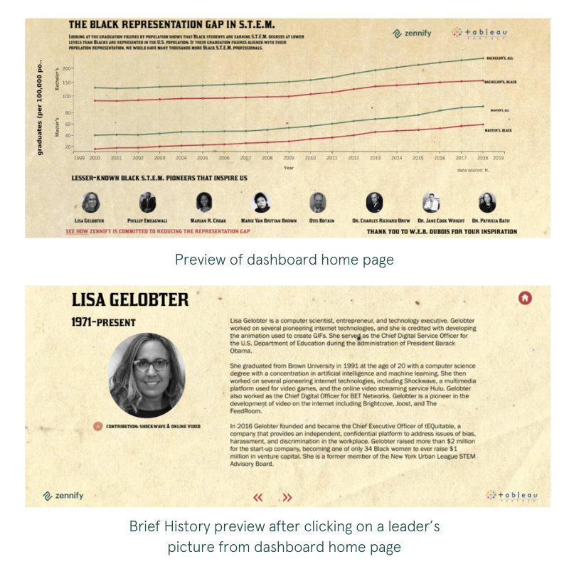
In celebration of Black History Month, we at Zennify set out to honor people of color in a creative way. More specifically, we hoped to shine a light on those who played a vital role in laying the foundation for the technology industry that stands before us today.

With this goal in mind, we conceptualized a dashboard that displays alternate means of exploring data while simultaneously paying homage to those who paved the way.

The idea behind this dashboard was not only to present thought-provoking data points, but to educate the audience as well. A brief look into the history of each leader represented on the dashboard provides viewers with an understanding of their impact on the tech industry.

Data Visualization Pioneer

Fittingly, the dashboard’s overall design was inspired by the work of W.E.B. Dubois, an African American whose many achievements reshaped American society’s perception of Black citizens. His work constantly exceeded the bounds of what was thought to be possible, all while bringing awareness to the overwhelming inequality at hand.

What many people don’t know is that, aside from his many outstanding accomplishments, Dubois actually pioneered alternate data visualization—and did so by hand (see examples below).

Tools & Design

Since Salesforce’s acquisition of Tableau, both environments have become highly complementary to one other. Leveraging the Tableau Viz Lighting Web Component, released in Winter 2020, we wanted to create a powerful visualization that would be showcased on Zennify’s Salesforce org homepage.

We began in Tableau Desktop, using a data source from the National Center for Science and Engineering Statistics (NCSES). This data compared the number of Bachelor’s and Master’s S.T.E.M. degrees earned by African Americans over the past 20 years to those earned by all races over the same time period. We found that a line graph perfectly illustrated the visual message, which was the significant representation gap of Black students in S.T.E.M. Once settled on a graph, we brought the sheet over to the Tableau Desktop dashboard tab to begin design.

We gave the dashboard the look and feel of Dubois’ historical graph documents using elements like the paper below that mimics the worn look of Dubois’ documents from the late 1800s.

By default, the dashboard size was set to automatic in order to suit the layout/format of any standard device (mobile, tablet or desktop). After adding text and placing images, we dove into the interactive navigation of the dashboard. We linked the image of each leader, directing users to a dedicated page featuring a brief history of the individual and their impact on the tech industry.

Next, we selected colors for line representation and a typeface.

For ease of navigation, we placed a set of “previous” and “next” arrows, as well as a home button, on each leader history page.

We also placed and linked the Zennify logo in the bottom corner of each page, giving the audience the option to learn more about our company and its initiatives.

We’re honored to celebrate such admirable and impactful Black leaders.

Forever thankful,

Zennify

Written By:

Share this article